
Thursday, March 30, 2017
Wednesday, March 22, 2017
Abstract blog
 texture with line
  shape with pattern
  balance
  abstract texture with line
 shape with pattern
  balance
1• Which is your favorite shot and why?
2• Which shot shows the best use of the elements of art?
3• What principles of design are used in your favorite image?
4• Which image + filter is your favorite shot and why?
1. my favorite shot is the shape with pattern that is photoshopped because it has a weird form to it and it looks cool.
2. The texture with line because you can see the shape, line, color and space.
3. in my favorite picture the principles of design that were used were unity, proportion, emphasis and rhythm.
4. my favorite image and filter is the abstracted because its blurry but the color looks amazing
HDR PHOTOGRAPHY
In photography HDR is high dynamic range. this means that the camera will process photos slightly differently than normal in order to capture greater detail from bright and dark areas in your photo.
#1: You can take a light, a dark and a medium photo and plug them into the software.
#2: You can take a picture with the iPhone 6 or take an HDR picture with a camera that has that feature. In this picture I am impressed because the lighting looks cool and also the way the top of the stairs looks like you're entering a new world.
#1: You can take a light, a dark and a medium photo and plug them into the software.
#2: You can take a picture with the iPhone 6 or take an HDR picture with a camera that has that feature.
 In this picture I am impressed because the lighting looks cool and also the way the top of the stairs looks like you're entering a new world.
Tuesday, March 14, 2017


Wednesday, March 8, 2017
Exploring landscapes
 saturation
  lab color picture
  Channel mixer
  gradient
  image 1
  image 2
  image 3
 burning edges
1. Did you use the rule of thirds? What did you emphasize with it sky or land?
I did use rule of thirds, i emphasized the sky because its darker now. (Burning edges images)
2. What Principles of design did you use and how?
2. What Principles of design did you use and how?
I used emphasis, proportion, variety, unity
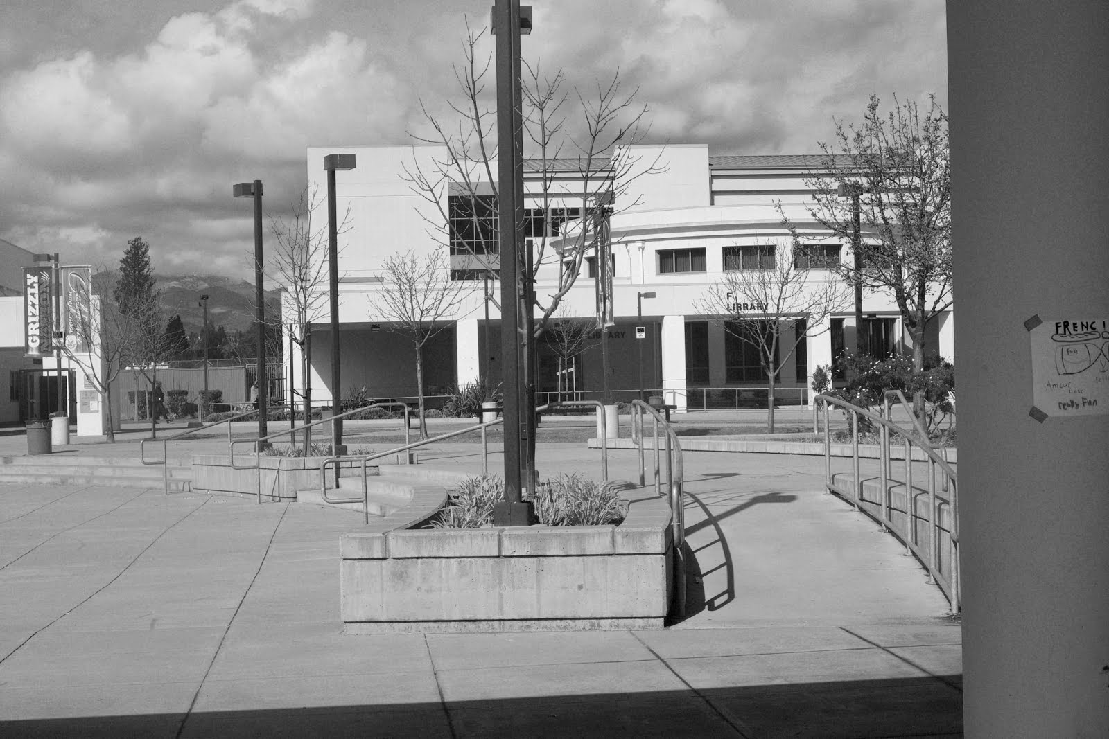
emphasis: I emphasized the library.
Proportion: i tried to balance the light poles so they can be the same
Variety: The plants, library, light poles, and railings are the variety.
Unity: the lights poles and the plants are the unity.
emphasis: I emphasized the library.
Proportion: i tried to balance the light poles so they can be the same
Variety: The plants, library, light poles, and railings are the variety.
Unity: the lights poles and the plants are the unity.
• What time of day was your image taken? Was it a good time to shoot or not? Why?
It was about 1:35 pm it was a great shot because the lighting and balance are really good.
How did you use the foreground/background relationship?
The things in the back ground are more in focus than the foreground because they are more in focus.
It was about 1:35 pm it was a great shot because the lighting and balance are really good.
How did you use the foreground/background relationship?
The things in the back ground are more in focus than the foreground because they are more in focus.
Which method do you think produced the best result for you?
I think the best method was saturation because it looks really nice and the quality of the picture is elite.
• Did you achieve a large value range for each image? If not, which methods worked the best?
I didn't really get a good value range for each image because there really dark but have good quality.
Wednesday, March 1, 2017
Close Landscape


Subscribe to:
Posts (Atom)